
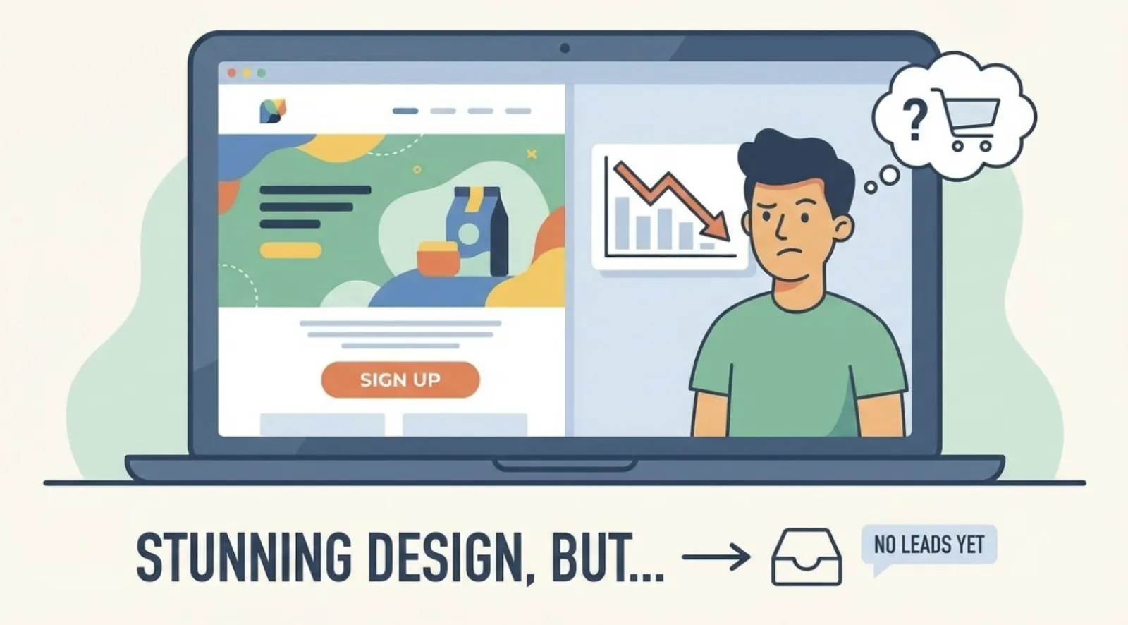
Is your landing page looking stunning but failing to deliver leads or sales? Are you pouring money into traffic only to see visitors bounce without taking action? The frustrating truth is that a beautiful design often masks deeper, more critical conversion problems. It’s time to shift focus from pixels to persuasion.
In today’s competitive digital landscape, every click counts. You invest time, money, and effort into driving traffic to your landing pages, expecting a steady stream of conversions. But when those expectations fall flat, many immediately jump to redesigning. However, the real culprits behind low conversion rates are rarely about aesthetics.
They are often rooted in fundamental flaws related to your messaging, audience understanding, and offer clarity. This guide reveals the true reasons your landing page isn’t converting, providing actionable strategies to transform your pages into powerful conversion engines. Get ready to uncover the overlooked elements that truly drive user action and learn how to optimize for success.
Get your free Marketing Action PlanNot sure where to start? Answer a few questions and get your plan in about a minute. No email needed.
Get my plan →Understanding Why Aesthetics Alone Won’t Drive Conversions
The Common Misconception About Landing Page Design and Performance
For years, the prevalent belief has been that a visually appealing landing page design is the primary driver of conversions. Businesses spend fortunes on sleek layouts and captivating graphics, often to be met with stagnant conversion rates. While professional, user-friendly design contributes to a positive first impression, its role is often overestimated for getting visitors to take a specific action. Visitors arrive with an intent or need; if your content doesn’t speak directly to that, beautiful imagery won’t convince them to convert.
Why a Pretty Page Can Still Fail to Convert Your Ideal Customers
Imagine walking into a stunning luxury car showroom. Everything looks exquisite. But if the salesperson discusses irrelevant features, or the price is beyond your budget, you’ll leave. The same applies to your landing page. A pretty page can still fail because it lacks a clear, compelling value proposition, targets the wrong audience, has confusing calls to action, or simply doesn’t align with the visitor’s journey. It’s about utility and persuasion, not just decoration.
Unmasking the Core Issues Beyond Visual Appeal
Mismatched Messaging: When Your Ad Promises One Thing and Your Page Delivers Another
This is arguably the most common and critical conversion killer. Visitors click on an ad because of a specific promise. When they land on your page, they expect that promise to be reaffirmed. If your landing page headline and body copy veer off-topic or use different language, you create immediate cognitive dissonance. This mismatch leads to confusion, distrust, and ultimately, a quick exit. Ensure a seamless transition from the ad copy to the landing page content.
Lack of a Clear Value Proposition: What’s In It For Them?
Your value proposition is the beating heart of your landing page. It’s the core reason why a visitor should choose you over a competitor. Many pages are filled with jargon or a long list of features. While features are important, what truly resonates are the benefits – how those features solve problems or improve lives. A strong value proposition should be concise, compelling, and instantly understandable.
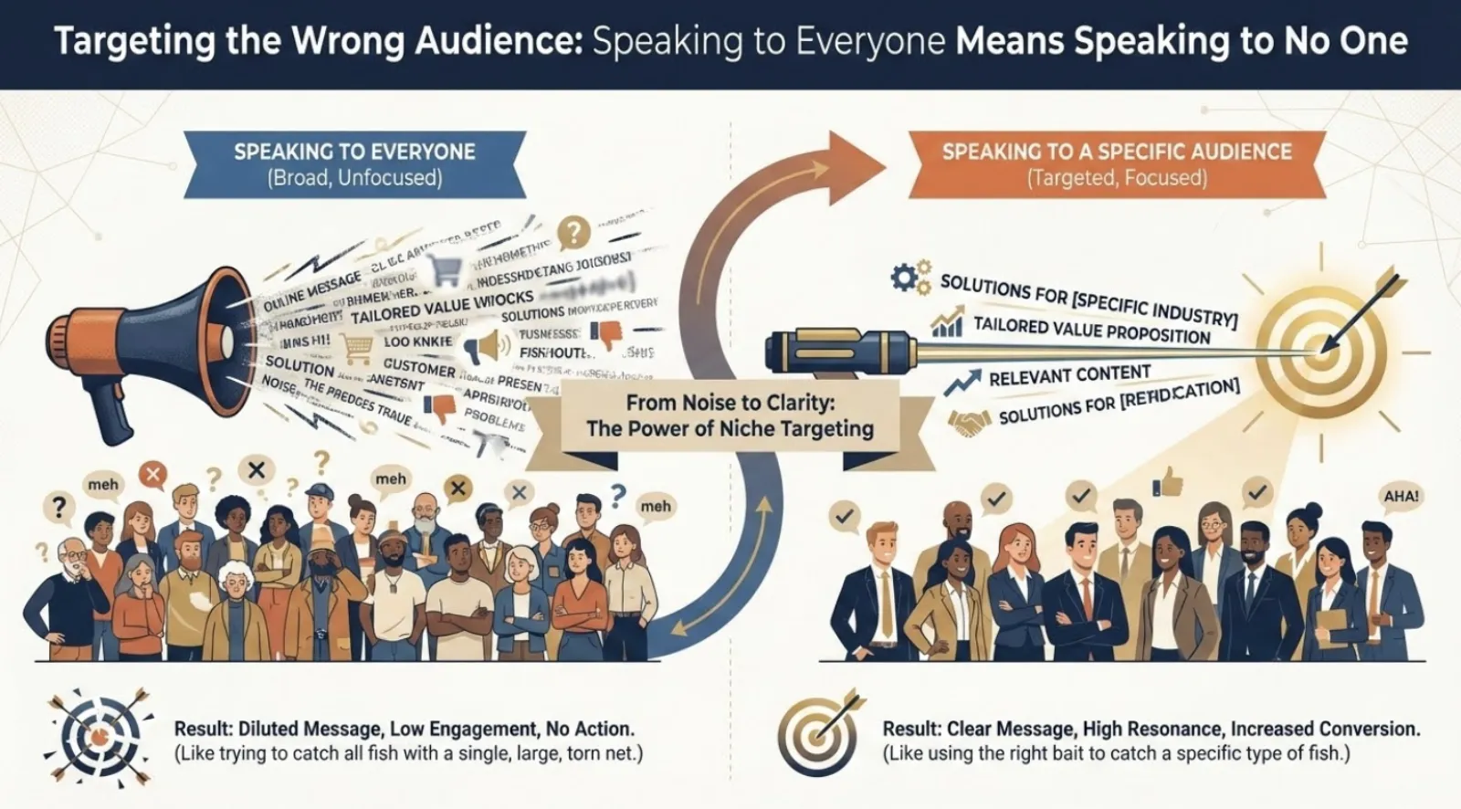
Targeting the Wrong Audience: Speaking to Everyone Means Speaking to No One
Even the most perfectly crafted landing page will fail if presented to the wrong audience. Effective marketing starts with a deep understanding of who you’re trying to reach. Are you targeting small business owners or tech enthusiasts? Each group has distinct needs. If your landing page attempts to appeal to a broad, undefined audience, its message becomes diluted. Your content, tone, and call to action should be hyper-tailored.
Confusing or Overwhelming User Experience: Too Many Choices, Too Little Guidance
User experience (UX) can be a major problem. This isn’t about aesthetics but about the ease and clarity with which a user can navigate and complete the desired action. Common UX pitfalls include:
- Too many calls to action (CTAs): Multiple CTAs dilute focus and create decision paralysis. Your landing page should have one primary goal.
- Information overload: Too much text or too many images can overwhelm visitors. Keep it concise and scannable.
- Complex forms: Asking for too much information too soon deters users. Ask only for essential details.
- Slow loading times: A slow-loading page is a guaranteed **conversion killer**. Optimize for speed.
- Lack of mobile responsiveness: If your page isn’t optimized for smaller screens, you alienate a massive audience.
A seamless, intuitive user experience guides visitors effortlessly towards conversion, minimizing friction.
Lack of Trust and Credibility: Why Should They Believe You?
In the digital age, trust is paramount. Visitors are wary of scams or over-hyped promises. If your landing page doesn’t establish immediate credibility, people will hesitate to provide information or make a purchase. Elements that build trust include:
- Social Proof: Testimonials, reviews, and client logos demonstrate that others have benefited.
- Security Indicators: SSL certificates and trust badges reassure users their data is safe.
- Expert Authority: Awards, certifications, or media mentions boost perceived expertise.
- Professional Language and Error-Free Copy: Typos or grammatical errors erode credibility.
- Clear Contact Information: Showing a phone number or email indicates a legitimate business.
Integrate these elements strategically to overcome skepticism and encourage action.

Implementing Proven Tactics for Landing Page Success
Crafting a Compelling, Benefit-Driven Headline and Subheadings
Your headline is the most critical piece of copy. It’s the first thing visitors see and often determines whether they stay. Focus on writing headlines that:
- Are benefit-oriented: Clearly state what the user will gain. E.g., “Boost Your Sales by 30% with Our Intuitive CRM.”
- Are clear and concise: Avoid jargon. Get straight to the point.
- Match your ad copy: Ensure perfect message match from the originating source.
Subheadings should break up your content, make it scannable, and highlight benefits. Use them to guide the reader and reinforce your value proposition.
Optimizing Your Call to Action (CTA) for Maximum Impact
Your CTA is the gateway to conversion, and it needs to be irresistible. Here’s how to optimize it:
- Make it prominent: Use contrasting colors, ample white space, and place it above the fold.
- Use action-oriented language: Instead of generic “Submit,” try “Get My Free Ebook” or “Start My 14-Day Trial.”
- Create urgency/scarcity (if applicable): Phrases like “Limited Time Offer” encourage immediate action.
- Add microcopy: Small lines of text near the CTA like “No Credit Card Required” alleviate concerns.
- Test different CTAs: A/B test wording, colors, and placements. Small changes yield significant results.
Even small changes can yield significant results in terms of conversion rates.
Leveraging Social Proof and Testimonials to Build Instant Credibility
Humans are inherently influenced by others. Social proof is a powerful psychological trigger. Incorporate:
- Customer testimonials: Use real quotes with photos. Focus on benefits.
- Case studies: Detailed stories of client success, especially for B2B.
- Review ratings: Display star ratings from platforms like Google.
- Client logos: Feature logos of well-known companies as endorsements.
- Quantitative data: “Over 10,000 satisfied customers” provides compelling evidence.
Place social proof elements near your value proposition and CTA to maximize impact. These are essential conversion drivers.

Simplifying Your Forms and Reducing Friction for Higher Completion Rates
Form abandonment is a major conversion killer. Every field adds friction. To optimize forms:
- Only ask for essential information: Gather only what’s necessary for the next step.
- Keep it above the fold if possible: Reduces scrolling and cognitive load.
- Use clear labels and instructions: Provide helpful hints (e.g., “Enter your business email”).
- Inline validation: Provide real-time feedback for errors.
- Consider multi-step forms: Breaking them into smaller steps makes them less intimidating.
The easier and quicker it is to complete your form, the higher your conversion rates. Respect visitors’ time and privacy.
The Power of A/B Testing: Continual Optimization for Peak Performance
Conversion rate optimization (CRO) is an ongoing process of testing and refining. A/B testing compares two versions of an element to see which performs better. Here’s a framework:
- Identify a hypothesis: “Changing CTA color from blue to orange will increase clicks.”
- Test one element at a time: Ensures you know what caused changes. Avoid multiple changes.
- Run tests for sufficient time and traffic: Don’t make decisions on insufficient data.
- Analyze results and implement winners: If proven, implement the winner. If not, learn and form a new hypothesis.
Tools like Google Optimize make A/B testing accessible. Consistent A/B testing continuously improves landing pages and maximizes conversion potential.
Learning from Real-World Conversion Success Stories
The SaaS Company That Doubled Demos by Clarifying Their Value Proposition
A B2B SaaS company struggled with low demo requests despite a slick landing page. Their page focused heavily on features. They realized their bounce rate was high, indicating visitors weren’t finding what they needed. Their solution wasn’t a redesign, but a complete overhaul of their messaging.
They changed their headline to “Cut Your Reporting Time by 50% and Gain Deeper Customer Insights.” Body copy focused on tangible benefits like time-saving and revenue growth, supported by testimonials. Within a month, demo requests more than doubled.
The E-commerce Brand That Increased Sales by Simplifying Their Checkout Form
An online fashion retailer experienced significant cart abandonment. Product pages were good, but customers dropped off during checkout. Their original form asked for extensive details, including optional survey questions. The team implemented a two-step checkout: first, shipping information, then payment details. They removed all optional fields and added clear progress indicators. A small line “Guest Checkout Available” was also added. The result was a 15% increase in completed purchases within weeks.
Common Questions About Landing Page Optimization Answered
What is the most important element of a high-converting landing page?
The most important element is a clear and compelling value proposition. It needs to immediately communicate what your offer is, how it benefits the visitor, and why they should choose you. All other elements, from landing page design to CTA, support this core message. If your value proposition is muddled, even the best design won’t save it.
How often should I update my landing pages?
You should continually optimize and A/B test your landing pages, rather than undertaking large, infrequent redesigns. Monitor performance regularly, conduct small tests on headlines, CTAs, images, and copy weekly or bi-weekly. A major overhaul might be needed every 1-2 years, or if your product/service significantly changes, but continuous small improvements are more effective.
Can a simple landing page still convert well?
Absolutely. In many cases, simpler landing pages convert better because they reduce distractions and focus the user’s attention on the primary call to action. As long as the page clearly communicates its value, matches the ad message, loads quickly, and provides a clear path to conversion, it doesn’t need to be complex or overly flashy to be highly effective. Simplicity often breeds clarity.
What are common mistakes beginners make with landing pages?
Beginners often make several key mistakes, including: failing to match ad copy to landing page content, using generic or unclear calls to action, having too much text or too many options, not including social proof, and neglecting mobile optimization. The biggest mistake is assuming a low conversion rate is purely a design problem without investigating deeper messaging and user experience issues.
How do I know if my landing page problem is actually design-related?
If your landing page loads slowly, is difficult to navigate on mobile, has broken elements, or uses extremely unprofessional or outdated aesthetics that actively deter users, then design could be a factor. However, if your page looks decent but isn’t converting, it’s more likely a messaging, value proposition, audience, or friction issue. Always address messaging and UX first, then evaluate design if problems persist.
Final Thoughts: Transforming Your Landing Pages from Static to Strategic
It’s time to retire the notion that a visually stunning landing page is the sole determinant of conversion success. While good design plays a supporting role, the true power of a high-converting landing page lies in its ability to resonate with your audience, communicate undeniable value, and guide them effortlessly towards action.
The problems aren’t usually found in aesthetics, but in the clarity of your message, the relevance of your offer, and the ease of the user journey. By focusing on message match, a strong value proposition, deep audience understanding, a simplified user experience, and unwavering trust, you can transform underperforming pages into dynamic conversion machines.
Ready to Unlock Your Landing Page’s True Potential?
Don’t let another day pass with an underperforming landing page. Take action now. Review your pages, focusing on message match, value proposition clarity, and user experience. Implement the actionable strategies outlined here – from optimizing headlines and CTAs to leveraging social proof. Start with small, impactful changes, test relentlessly, and watch your conversion rates soar.
If you’re ready for advanced strategies, explore our exclusive guide on ‘High-Impact Conversion Rate Optimization Techniques for Small Businesses’ to further refine your approach and turn more visitors into valuable customers. Your journey to conversion mastery begins today!

Written by Uzair Kharawala
Partner at SF Digital Studios, a Google Premier Partner agency. Uzair has been helping businesses grow with Google Ads since 2002 and teaches it every week on YouTube.
Get our best Google Ads tips by email
New articles and videos, straight to your inbox. Unsubscribe any time.