
Remember the days when you could slap a big “SALE!” banner across a product photo and call it a day? Or maybe you thought putting your logo in the corner of every ad image was a good way to build brand recognition? If you’re still doing that, you’ve probably noticed something a little annoying: your ads are getting disapproved. And it’s not just a one-off thing. It’s becoming a pattern.
This isn’t a glitch. It’s Google’s policy, and it’s a big deal. For many marketers, this change feels unfair and confusing. But once you understand the “why” behind it, it starts to make a lot of sense. And more importantly, you can adapt your strategy to get your ads approved and performing better than ever.
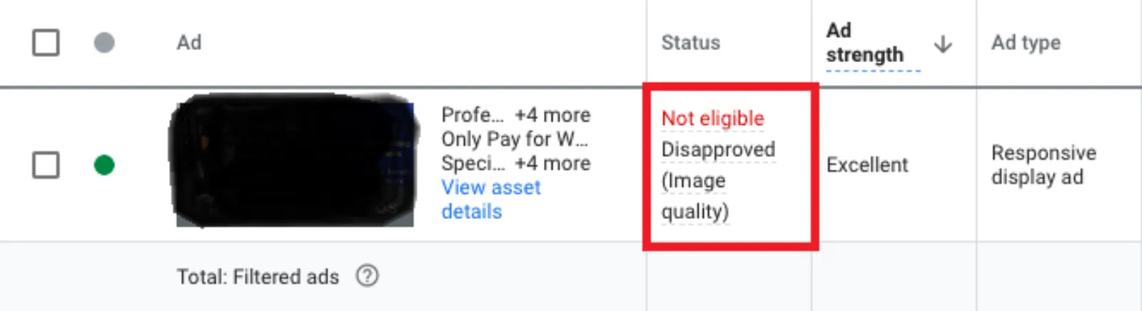
So, what’s the big deal with graphic and text overlays?
Google’s main goal is to provide a clean, high-quality experience for users. They want ads that are helpful, not disruptive. Think about it: when you’re scrolling through a website, do you want to see a beautiful, clear picture of a product, or a messy image with a bunch of text and a giant logo blocking the view? The answer is obvious. Google’s algorithms have gotten smarter, and they’re designed to find and punish these kinds of visual clutter.
Here’s a breakdown of the key reasons your ads might be getting disapproved:
1. Poor User Experience
This is the big one. An image with too much text or a huge logo is just not a good user experience. The image becomes hard to read, and the message gets lost. Google wants to show ads that are visually appealing and easy to understand at a glance. They want the image to tell the story, with the ad’s headline and description providing the details. When the image is cluttered, it fails at its most basic job.
2. Lack of Relevance
When you add a text overlay, you’re essentially changing the image’s original message. Let’s say you have a beautiful picture of a coffee mug. You put a text overlay that says “50% Off!”. While this is an offer, the image’s primary purpose is now a billboard, not a visual representation of the product. Google wants the image to be directly relevant to the product or service you’re advertising. The text and other ad elements should complement the image, not compete with it.
3. The Rise of AI and Automation
Google’s ad platform is now heavily automated. Their system uses machine learning to create and optimise ad combinations. This means they can take your images, headlines, and descriptions and mix and match them to find the best-performing ad. When an image has a text overlay, it’s a static part of the image. The AI can’t change it or use it with a different headline. This limits the AI’s ability to optimise your ad, which ultimately means a worse result for you. By using clean images, you’re giving Google’s AI the freedom to do what it does best: find the perfect ad for the perfect customer.
4. The “Collage” Problem
Google also has a policy against using collage in ads. This is similar to the graphic overlay rule. A collage is a combination of different images put together. Google sees this as a low-quality visual. They prefer a single, high-quality image that shows the product or service clearly. Graphic overlays, in a way, are like a mini-collage, layering different elements on top of a base image. This is why a simple, unedited photo is almost always the safest and most effective choice.
What to do instead?
Getting your ads approved and running is just the first step. The goal is to get great results. And the new rules actually push you toward better, more effective marketing.
1. Let your images be images. Use high-quality, clear photos that showcase your product or service without any extra junk. The image should speak for itself. For example, if you’re selling a watch, use a fantastic, professional photo of the watch on its own, not with a “Free Shipping!” text box covering half of it.
2. Use ad text for your message. This is what the ad headline and description are for. Use these elements to convey your offer, your brand message, and your call to action. They are specifically designed for text, and they will be seen more clearly by users.
3. Trust the system. It can feel strange to give up control and let Google’s AI decide how your ad looks. But this is the future of advertising. By providing high-quality, uncluttered assets, you’re giving the system the best possible chance to succeed. The data shows that the AI-powered combinations often outperform manually created ads.
In conclusion
The graphic overlay rule isn’t just a hurdle to jump. It’s an opportunity to create better, more effective ads. It forces us to think about design in a simpler, more user-friendly way. By ditching the overlays and embracing clear, beautiful imagery, you won’t just avoid getting banned—you’ll likely see your ad performance improve. It’s a design choice that’s getting marketers banned, but it’s also the design choice that’s setting the best marketers apart.

Written by Uzair Kharawala
Founder of SF Digital Studios, a Google Premier Partner agency. Uzair has been helping businesses grow with Google Ads since 2002 and teaches it every week on YouTube.
Get our best Google Ads tips by email
New articles and videos, straight to your inbox. Unsubscribe any time.