
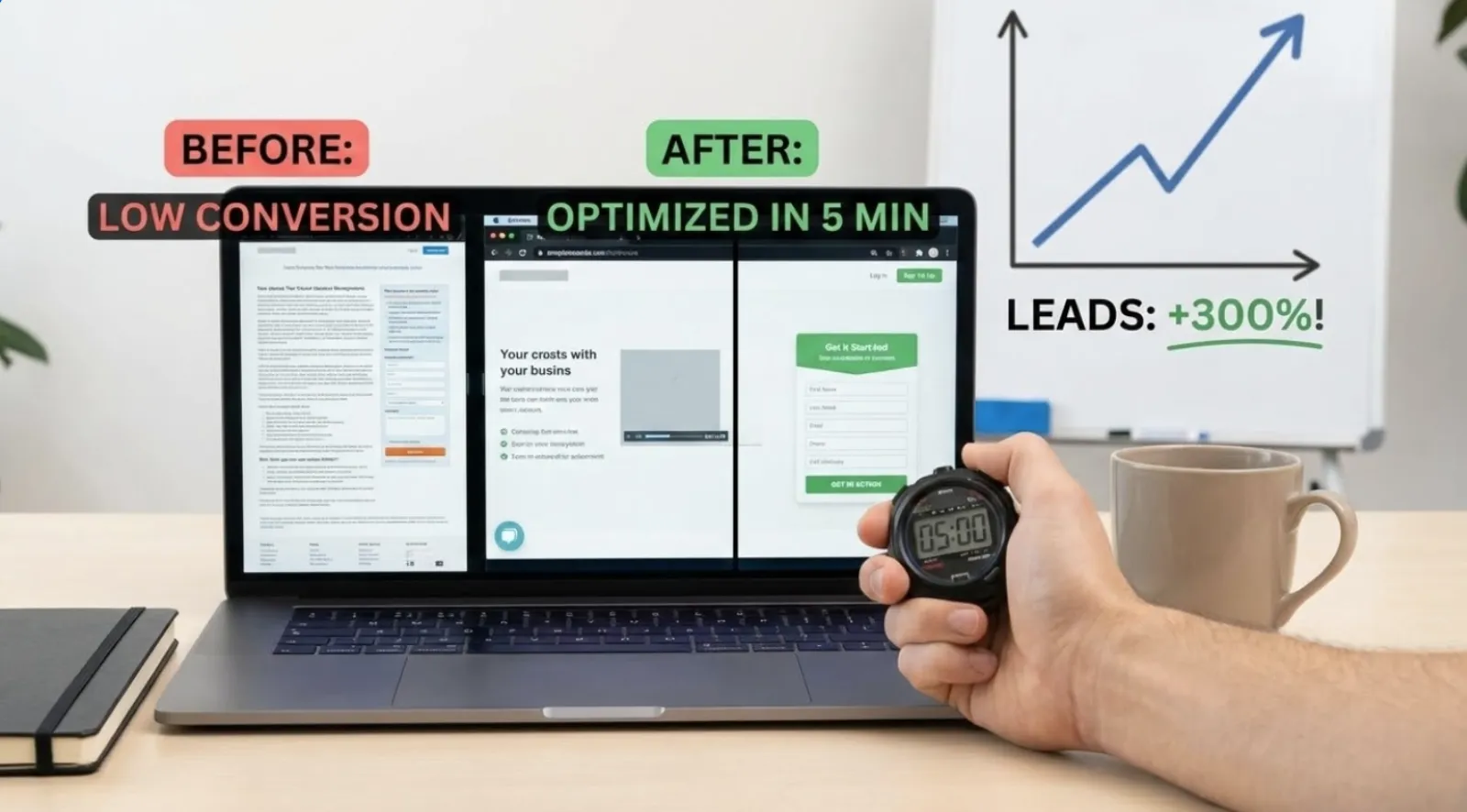
Did you know that increasing your conversion rate by just a few percentage points can lead to a massive surge in leads and sales without spending another dime on advertising? Many small business owners pour their hard-earned money into driving traffic to their websites, only to watch potential customers vanish into thin air. It’s like inviting guests to a party but not providing any directions to the fun. Your landing pages are those directions, and if they’re not optimized, you’re leaving money on the table.
In today’s fast-paced digital world, capturing attention and converting it into a lead is more crucial than ever. But here’s the good news: you don’t need a massive budget or a team of tech gurus to make a significant impact. This guide will walk you through simple, 5-minute tweaks that can transform your landing pages, making them magnets for leads and ultimately, tripling your business growth. Get ready to turn more visitors into valuable customers with practical, easy-to-understand strategies.
Understanding the Core Principles of Effective Landing Page Design and Why It Truly Matters
A landing page isn’t just another page on your website. It’s a highly specialized, single-purpose page designed to convert visitors into leads or customers. Unlike your homepage, which might have many navigation options and a broad overview, a landing page has one job: to get the visitor to take a specific action. This could be filling out a form, making a purchase, or signing up for a newsletter. When designed poorly, it acts as a leaky bucket, letting valuable prospects slip away. When optimized, it becomes a powerful lead generation engine.
Get your free Marketing Action PlanNot sure where to start? Answer a few questions and get your plan in about a minute. No email needed.
Get my plan →For many small business owners, the idea of “optimization” sounds complex and intimidating. But think of it simply as making your page as helpful and persuasive as possible for your specific audience. It’s about clear communication and removing any friction that might prevent someone from taking that next step. Imagine you’re at a busy marketplace, and you have just a few seconds to convince someone to buy your product. Your landing page is that quick pitch, and every element needs to be honed for maximum impact.
The Silent Salesperson: How Landing Pages Work Around the Clock for Your Business
Your landing pages are your 24/7 sales team. They work tirelessly to capture information, educate prospects, and guide them towards your offerings, even when you’re sleeping. Without an optimized landing page, every click on your ad or every share of your content could be a missed opportunity. This is especially vital for small business owners and non-technical readers who want to maximize their marketing efforts without breaking the bank. These pages are where your marketing budget truly pays off, converting curious clicks into tangible business growth.
Consider a local bakery running an online ad for a special offer on custom cakes. If that ad sends visitors to their generic homepage with dozens of links, the visitor might get lost, distracted, and ultimately leave without inquiring about the cakes. However, if the ad leads to a dedicated landing page showcasing the custom cakes, a clear offer, and a simple form to request a quote, the bakery significantly increases its chances of getting a new lead. It’s about focus and clarity.
Unlocking the Human Element: The Psychology Behind a High-Converting Page
Before we dive into specific tweaks, it’s crucial to understand the human brain. People make decisions based on emotion and then justify them with logic. A great landing page taps into this by addressing pain points, offering solutions, and building trust. Visitors are often looking for quick answers and immediate gratification. Your page needs to deliver on those expectations swiftly and convincingly.
Addressing Visitor Needs: Empathy as Your Conversion Catalyst
A truly optimized landing page speaks directly to the visitor’s needs, fears, and aspirations. It’s about empathy. What problem are they trying to solve? What desire are they hoping to fulfill? Your content should clearly articulate that you understand their struggle and have the perfect solution. This creates an instant connection and makes your offering far more compelling. Understanding your audience’s intent is the first step toward crafting a page that converts.
For example, if you sell productivity software, your landing page shouldn’t just list features. It should highlight how your software saves time for busy professionals, reduces stress, and helps them achieve their goals faster. Frame your solution in terms of the benefits the user will experience, not just the technical specifications.
The First Impression: Headline Hacks to Grab Attention in Mere Seconds
Your headline is the most important element on your landing page. It’s the first thing visitors see and often determines whether they stay or bounce. Think of it as your billboard: it needs to be clear, concise, and incredibly compelling. A strong headline immediately communicates your unique value proposition and promises a clear benefit.
One of the easiest 5-minute tweaks you can make is to refine your headline.
- Be Specific and Benefit-Oriented: Instead of “Our Software,” try “Cut Your Workflow Time in Half with [Your Software Name].”
- Use Numbers: Numbers grab attention. “5 Simple Steps to Boost Your Sales” is more engaging than “Ways to Boost Your Sales.”
- Create Urgency or Curiosity: “Limited-Time Offer: Secure Your Spot Today” or “Discover the Secret to Stress-Free Marketing.”
For instance, a local gym could change its generic headline “Join Our Gym” to “Transform Your Body in 30 Days: Get Your Free Trial Today.” The second option is far more compelling because it speaks directly to the desired outcome and includes a clear call to action.
More Than Just Words: Compelling Copy That Speaks Directly to Your Audience
Once your headline has hooked them, your body copy needs to reel them in. This isn’t about lengthy paragraphs filled with jargon. It’s about clear, concise, and persuasive language that guides the visitor toward your call to action. Each sentence should build on the previous one, reinforcing the value you offer.
The Art of Persuasion: Crafting Content That Converts Curious Visitors
Your copy should focus on the benefits, not just the features. People don’t buy drills; they buy holes. Similarly, your customers don’t buy your product or service; they buy the transformation or solution it provides. Use short paragraphs and simple language. Avoid industry jargon that might alienate a non-technical audience.
- Highlight Pain Points: Show that you understand their challenges.
- Present Your Solution: Clearly explain how your offering solves those problems.
- Emphasize Unique Selling Points: What makes you different and better?
- Use Bullet Points: Break up text and make key benefits easy to digest.
A great example is a financial advisor. Instead of listing “Investment Management Services,” they might write copy that addresses the fear of an uncertain future and offers “Peace of Mind with Expert Financial Planning for Your Retirement.” This instantly resonates more deeply with the potential client.
The Power of Visuals: Images and Videos That Drive Conversions
In our visually-driven world, what your landing page looks like is almost as important as what it says. High-quality, relevant images and short videos can significantly boost engagement and convey your message more effectively than text alone. They break up the page, make it more appealing, and help build trust.
Beyond Aesthetics: Selecting Visuals That Communicate Value and Build Trust
Choose visuals that are professional, high-resolution, and directly relevant to your offer. Avoid generic stock photos that feel impersonal. If you’re selling a product, show it in use. If you’re offering a service, show happy customers or the results they achieve. A short, explainer video can be incredibly powerful, summarizing your offer in an engaging way.
- High-Quality Product Shots: If selling products, showcase them clearly.
- Relevant Hero Image: The main image should quickly convey your message.
- Authentic Team Photos: For service-based businesses, this builds trust.
- Short Explainer Videos: A 60-90 second video can explain complex offers simply.
Consider an online course creator. Instead of just text describing the course, a vibrant image of students actively learning or a short video testimonial from a successful graduate would be far more effective in encouraging sign-ups. Visuals tell a story instantly.
The Guiding Light: Call to Action (CTA) Mastery for Maximum Engagement
Your Call to Action (CTA) is the most critical element on your landing page. It’s the moment of truth, the instruction you give your visitor on what to do next. A weak, unclear, or poorly placed CTA can cripple your conversion rates, even if everything else is perfect. This is a prime area for a quick 5-minute tweak.
Crafting Irresistible Buttons: How to Encourage the Next Step
Your CTA needs to stand out, be clear, and create a sense of value or urgency.
- Use Action-Oriented Language: Instead of “Submit,” try “Get My Free Ebook,” “Start Your Free Trial,” or “Claim Your Discount Now.”
- Make it Visually Prominent: Use contrasting colors, larger text, and ensure it’s easy to find (often “above the fold” or clearly visible without scrolling).
- One Primary CTA: Avoid overwhelming visitors with too many options. Guide them towards a single, clear next step.
A common mistake is having a tiny “Click Here” button. Imagine a real estate agent. Instead of a small “Contact Us,” a large, brightly colored button saying “Schedule Your Free Home Valuation” is far more persuasive and descriptive, telling the user exactly what will happen next.
The Gateway to Your Leads: Streamlining Your Form Optimization
If your CTA is the guiding light, your form is the gateway. This is where visitors provide their information, becoming leads. A long, complicated, or confusing form is a major turn-off and will send potential leads running. Form optimization is about making this process as smooth and painless as possible.
Minimizing Friction: Designing Forms That Encourage Completion
The fewer fields you ask for, the higher your conversion rate will likely be. Only ask for the information you absolutely need at that stage of the customer journey. You can always gather more information later.
- Keep it Short: For initial lead capture, often just name and email are sufficient.
- Use Clear Labels: Make it obvious what information goes into each field.
- Employ Inline Validation: Provide real-time feedback if a field is filled out incorrectly.
- Add a Privacy Statement: A short line like “We respect your privacy. Your information will never be shared.” builds trust.
Let’s say a software company is offering a free demo. Instead of asking for company size, job title, phone number, and industry on the initial form, they could simply ask for “Name” and “Email.” Once the lead is qualified, they can gather more details during the demo scheduling call. This reduces friction significantly.
The Need for Speed: Don’t Lose Them Before They Even Start
In our instant-gratification society, patience is a rare commodity. If your landing page takes more than a few seconds to load, visitors will likely hit the back button before they even see your amazing offer. Page speed is a critical ranking factor for search engines and a non-negotiable for user experience.
Ensuring Accessibility: Optimizing for a Seamless Mobile and Desktop Experience
Beyond speed, your landing page must be mobile-responsive. More people browse the internet on their smartphones than on desktops. If your page looks clunky, has tiny text, or requires excessive pinching and zooming on a mobile device, you’ll lose a huge segment of your audience.
- Compress Images: Large image files are often the biggest culprits for slow loading.
- Minimize Code: Reduce unnecessary JavaScript and CSS.
- Use a Reliable Hosting Provider: Good hosting makes a difference.
- Test on Multiple Devices: Ensure your page looks and functions perfectly on desktops, tablets, and smartphones.
You can often improve page speed in just a few minutes by using free online tools to check your site’s performance and get recommendations. Simply optimizing image sizes alone can make a dramatic difference.
Building Bridges: Trust Signals to Establish Credibility with Ease
In a world full of scams and misinformation, people are inherently skeptical. Your landing page needs to quickly establish trust and credibility. Without it, even the most compelling offer will fall flat. Trust signals are elements on your page that reassure visitors that you are legitimate and reliable.
From Skepticism to Confidence: Elements That Instantly Build Credibility
These signals can be subtle yet powerful. They tell your visitors that others have trusted you and had positive experiences.
- Customer Testimonials/Reviews: Short, authentic quotes from satisfied customers.
- Social Proof: Displaying logos of companies you’ve worked with or media mentions.
- Security Badges: For e-commerce or sensitive data pages, showing SSL certificates.
- Guarantees/Warranties: Reducing perceived risk (e.g., “30-Day Money-Back Guarantee”).
- Awards or Certifications: Any recognition that boosts your authority.
For a freelance web designer, instead of just saying “I build great websites,” a landing page with client logos and a quote like, “Our traffic doubled after [Designer’s Name] revamped our site!” from a recognizable business builds far more credibility and confidence for potential clients.
The Scientific Approach: A/B Testing as Your Secret Weapon for Continuous Improvement
Even with all these tweaks, you won’t know what truly resonates with your audience until you test it. A/B testing, also known as split testing, is the process of comparing two versions of a webpage to see which one performs better. This isn’t about guesswork; it’s about data-driven optimization.
Experimentation for Excellence: Iterative Improvements for Higher Conversions
For beginners, A/B testing might sound technical, but many tools make it incredibly user-friendly. Start with small, significant changes. For instance, test two different headlines or two different CTA button colors.
- Test One Element at a Time: Don’t change too many things at once, or you won’t know what made the difference.
- Focus on High-Impact Elements: Headlines, CTAs, and hero images are great starting points.
- Run Tests for Sufficient Time: Let your test run long enough to gather statistically significant data (often a few weeks, depending on traffic).
- Analyze and Implement: If one version consistently outperforms the other, make that the new standard.
A small online boutique, for example, could A/B test two different offers on its landing page: “Get 15% Off Your First Order” versus “Free Shipping on All Orders.” By tracking which page generates more sales, they can identify the more appealing incentive for their audience.
Frequently Asked Questions About Landing Page Optimization
Here are some common questions small business owners and non-technical readers often have about optimizing their landing pages:
1. How often should I update my landing pages?
You should review and potentially update your landing pages regularly, especially after running A/B tests or when your offers, products, or audience insights change. Aim for at least a quarterly review, but continuous small tweaks based on performance data are even better.
2. What’s the single most important element to optimize first?
While all elements are important, your headline and Call to Action (CTA) are often the highest-impact elements to optimize first. These are the primary drivers of immediate engagement and decision-making on your page.
3. Do I need a professional designer to create an optimized landing page?
Not necessarily! Many user-friendly landing page builders (like Leadpages, Unbounce, or even features within website builders like Wix and Squarespace) allow non-technical users to create effective, optimized pages using drag-and-drop interfaces and pre-designed templates.
4. How can I track if my landing page tweaks are actually working?
You need to set up conversion tracking. This involves using tools like Google Analytics or your landing page builder’s built-in analytics to measure specific actions, such as form submissions, clicks on a CTA, or purchases. A/B testing tools will also provide direct comparison data.
5. Is it okay to have multiple offers on one landing page?
Generally, no. The best practice for landing pages is to have one clear goal and one primary offer. Multiple offers can confuse visitors and dilute your message, leading to lower conversion rates. Keep it focused and direct.
Final Thoughts: Your Path to Triple Leads Begins Now
Optimizing your landing pages doesn’t have to be a daunting task. By focusing on these 5-minute tweaks, you can make significant improvements that lead to a dramatic increase in your leads and, ultimately, your business’s success. From crafting compelling headlines and persuasive copy to ensuring fast load times and clear calls to action, every element plays a crucial role in converting visitors into valuable customers.
Remember, the goal is to create a seamless, trustworthy, and irresistible experience for your audience. Start with one tweak, measure the results, and then move on to the next. The journey to tripling your leads is an iterative one, built on continuous improvement and a deep understanding of your customer. Take action today, apply these insights, and watch your conversion rates soar!
Are you ready to stop leaving leads on the table and start building landing pages that truly perform? Implement these strategies today and unlock the full potential of your marketing efforts.

Written by Uzair Kharawala
Partner at SF Digital Studios, a Google Premier Partner agency. Uzair has been helping businesses grow with Google Ads since 2002 and teaches it every week on YouTube.
Get our best Google Ads tips by email
New articles and videos, straight to your inbox. Unsubscribe any time.